Adira
Web development, UX/UI
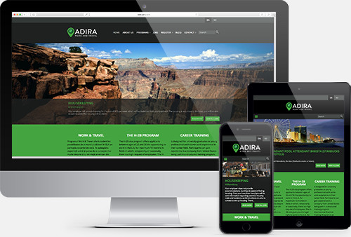
A fresh new site

Adaptability, prerequisite of evolution
Clear, clean, minimalistic, with lively colors, the website is readable on any device. The backend is easy to use and snappy, e.g. the various job offers can be posted or tagged as Sold out with just one click.
Branding
A new identity

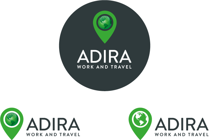
A new logo
Adira places you on the map by sending you in the most beautiful places in the US (for details, check the job offers on the website). This was the concept at the core of the rebranding. The logo can be easily presented in simple as well in as in more complex iterations, always clear and visible.

Visual Identity
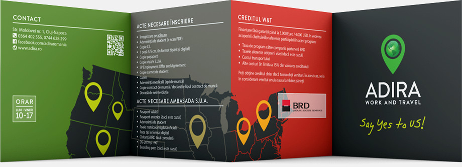
Leaflets, postcards, brochures, banners, meshes... Pretty much everything that makes the visual identity of a respectable business. And checks. Seriously. Every now and then, they give away prizes.

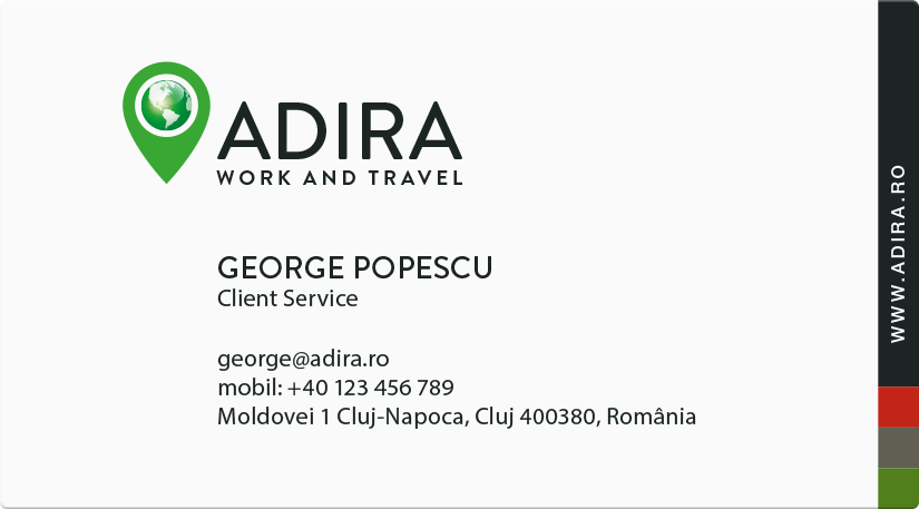
Business cards
Obviously there is no George Popescu working for Adira. We could’ve gone for Lorem von Ipsum for those able to cheer for a typo joke.