Hodis Film
Web development
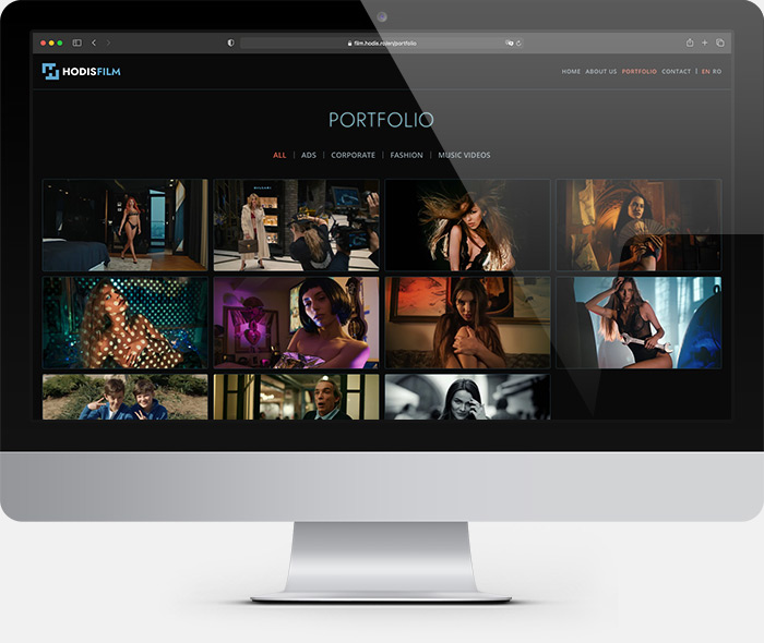
The portfolio

Simple, clear, to the point
An online portfolio must highlight the artwork, the site design being a silent support.

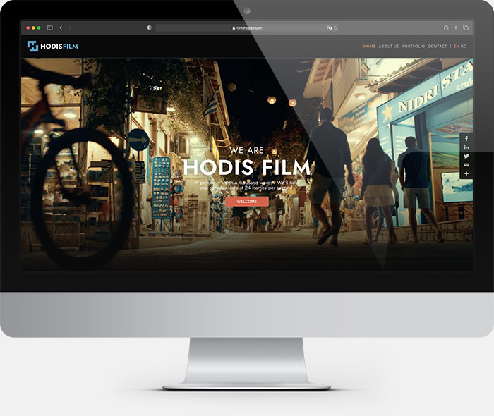
Welcome to the Dark Side
Everyone would start booing if in a cinema someone forgot the lights on during the screening, so we turned off the lights too, adopting a dark visual theme. The discreet color accents are reminiscent of the color palette so dear to Michael Bay.

The logo
We have developed a simple and robust logo, easy to reproduce in various sizes, from the mobile phone to the cinema screen. The drawing uses the negative space to reveal the initials HF.

Business cards
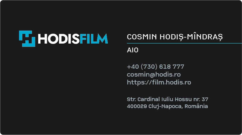
Many printed items – leaflets, catalogs, etc. – start to disappear being replaced by their digital equivalent, a website, a portfolio or an online store. Not the business card, a form of respect both for the partner we hand them over and for the brand we represent.