Mark Information
Trecut, prezent și viitor

Material Design
The visual metaphor of choice for ProMark is Material Design, a design language developed in 2014 by Google. Although the guidelines are quite thorough, they simply can not cover the broad scope of the application, therefore we had to extend and adapt Material Design's principles to ProMark specifics.
ProPortal

Câteva reguli de bază
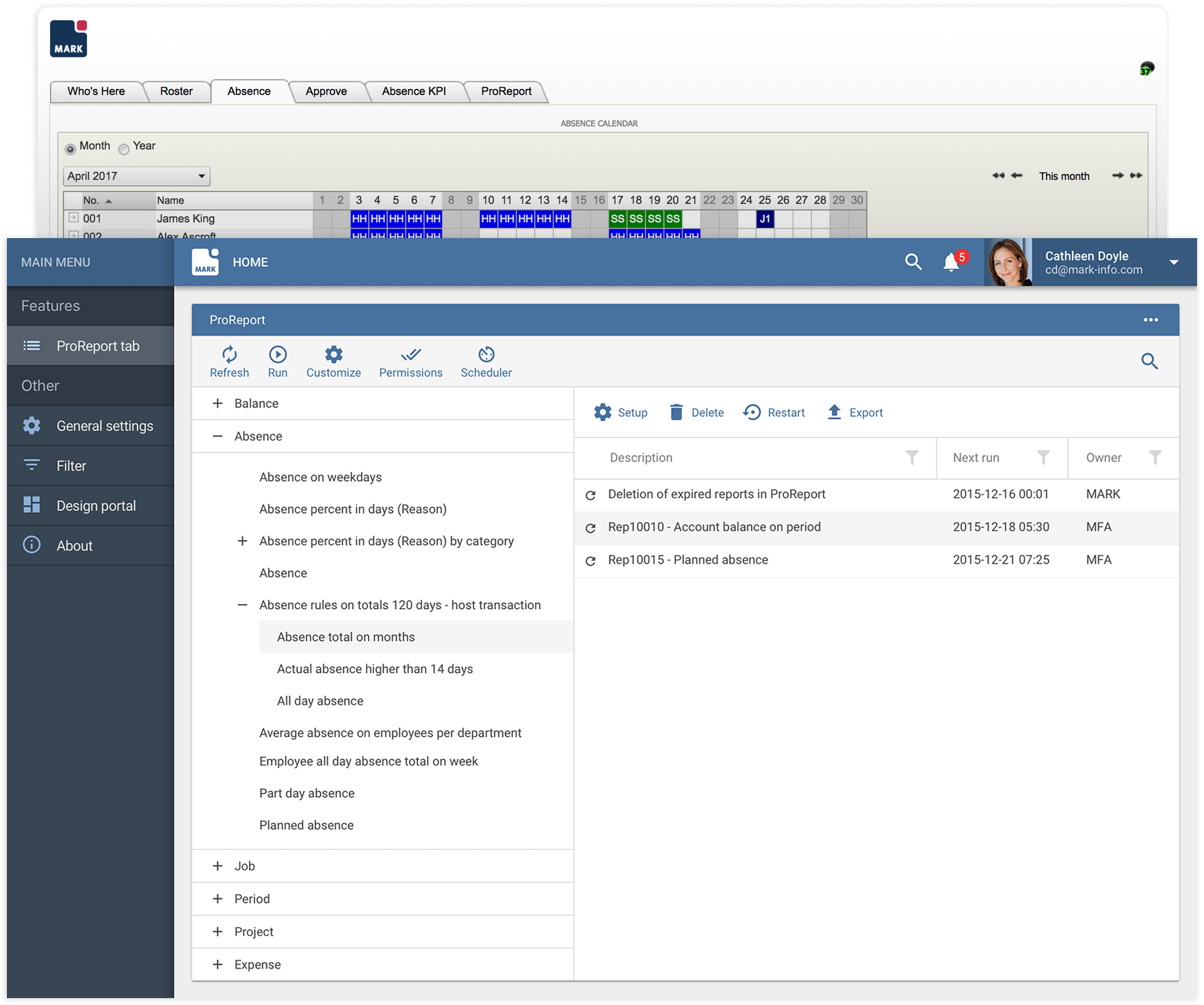
We have adapted the ProPortal UI to the current design trends, without making any assumptions and following the inherent purpose of the application. The application is built using key elements – web parts – which are widgets that can be as simple or complex as their function demands. They are functionally interconnected, so understanding the business case and use case here is crucial.

Symmetry, simplicity, and ease of use
In order to reduce the number of interactions required to perform a task we exposed functionalities in a logical manner, combining display and edit views into a highly interactive and intuitive interface.
Above:
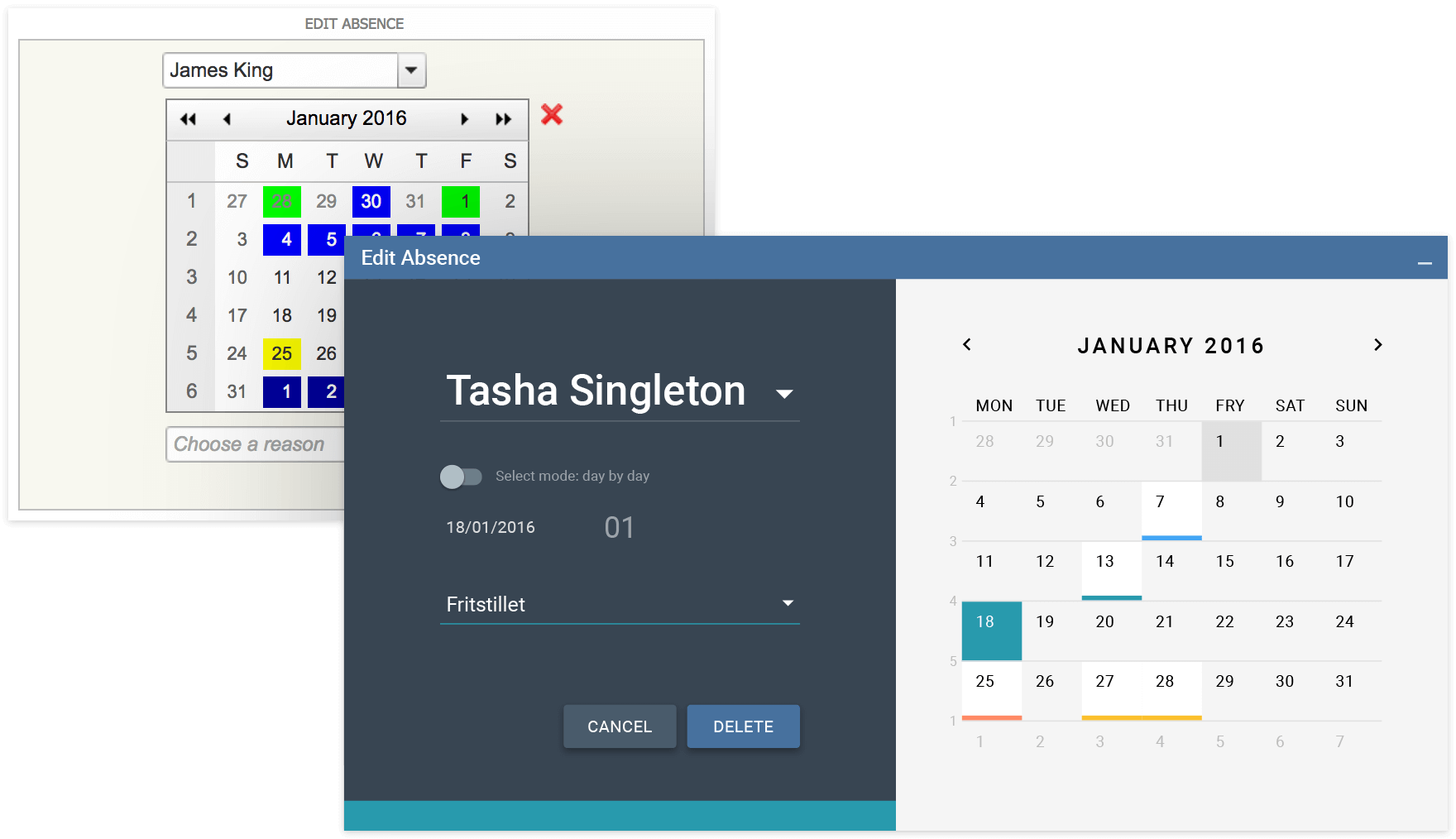
The Edit Absence web part allows users to add and edit an absence, by selecting a time interval as well as a reason; subsequently, a supervisor can approve, reject or delete that absence. The absence reasons are colour-coded, so a quick look to the calendar will help assess the employee's status.

One step at a time
Even the most daunting tasks become simple, if they are divided into parts that are easy to grasp.
Above:
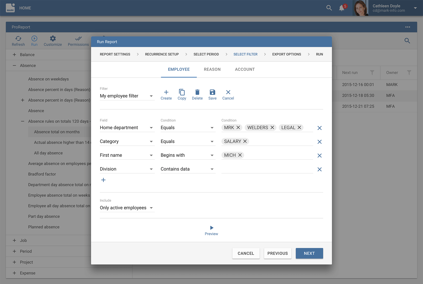
Running a Report, a step-by-step procedure that involves data filtering based on a user-specified set of parameters, can be done easily through a wizard interface.
ProMobile

Mobility everywhere
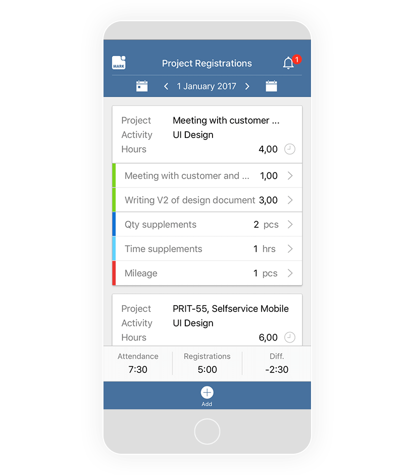
A true mobile experience, ProMobile has applications taylored for every major platform – iOS, Android and Windows, as well as every device type – smartphone and tablet.